Acrobat Reader

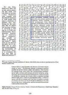
Acrobat Reader talks about the increased focus on visuals in novels. One example is Mark Danielewski's House of Leaves. I've read this book and every time the word "house" is written, it is written in blue. The book describes a family who just bought a house. This house is posessed of some spirit, and begins to grow on the inside, but not on the outside. From the outside, it looks like the same house. But when the family returns from a vacation, there is a sudden appearance of an extra closet that didn't used to be there. Eventually the children hear sounds coming out of the closet and begin to play in there. The father is a film maker and tries to create a documentary of him mapping out the mysterious growing space. Once he enters the closet, the complete darkness meets him and the walls change and the space grows depending on his emotional state.
The typography for the book changes as well to reflect the change in space, and emotional state of the characters. The reader is greeted by pages smacked full of text and then suddenly an empty void. The text changes orientation, color, and fonts.
While this was visually interesting enough for me to pick up the book, it actually became slightly annoying at a cliffhanger. I think it was successfull in portraying the characters' sink into mental problems, but at times one word was repeated for three pages, so i would just skip ahead.
The picture on this post is from a page from the House of Leaves. The higlighted blue box is actually a backwards reflection from the page ahead.

0 Comments:
Post a Comment
Subscribe to Post Comments [Atom]
<< Home