Tuesday, February 19, 2008

Readings for Spring 2008

GRAD READING SCHEDULE


TH 1/17 Intro

T 1/22

TH 1/24

T 1/29 Strong Words

TH 1/31 Encyclopedia Erratica


T 2/5 Women and Design by Michael Bierut
http://www.designobserver.com/archives/020303.html

TH 2/7 No Class – MK 12 VISITING

T 2/12 How High Do We Set the Bar for Education? - Meredith Cullen

TH 2/14 Remaking Theory, Rethinking Practice - Andrew Blauvelt

T 2/19 Designer as Author Series SVA: Ellen Lupton
to access:
-enter itunes store and click "podcasts"
-search for SVA MFA Designer as Author: Guest Lectures

The Producers by Ellen Lupton
http://www.elupton.com/index.php?id=48

TH 2/21 CAA - Dallas

T 2/26 Is Apple Soft on Crime?
http://www.designobserver.com/archives/031308.html

Under Consideration/Speak up Response:
http://www.underconsideration.com/speakup/archives/004308.html


TH 2/28 Designers don't read...enough by Armin Vit
http://www.aiga.org/content.cfm/designers-dont-read-enough


T 3/4 Sustainable Consumerism
By Chris Riley (Émigré)

TH 3/6 Alice Twemlow
When Did Posters Become Such Wallflowers? (Design Observer)

T 3/11 Digital Humanism - Charles H. Traub and Jonathan Lipkin

TH 3/13 Of Bonding and Bondage: Cult, Culture, and the Internet - Denise Caruso


T 3/18 Spring Break

TH 3/20 Spring Break

T 3/25 In and Around: Cultures of Design and the Design of Cultures
Part I , By Andrew Blauvelt (Émigré)


TH 3/27 In and Around: Cultures of Design and the Design of Cultures
Part II, By Andrew Blauvelt (Emigré)


T 4/1 Design as Slow Motion Train Wreck
http://www.aiga.org/content.cfm/design-as-slow-motion-train-wreck

TH 4/3 DSVA - Dallas

T 4/8 Why is This Font Different Form All Other Fonts?
http://www.designobserver.com/archives/025809.html


TH 4/10 Graphic Authorship - Michael Rock

T 4/15 The Designer as Producer - Ellen Lupton

TH 4/17 Reed Fahnestock's MFA Thesis Paper

T 4/22 Back to School
http://www.designobserver.com/archives/027923.html

TH 4/24

T 4/29


TH 5/1

T 5/6

TH 5/8 –Last day of class

Monday, February 18, 2008

I love this new logo blog....

Thought I'd share.

Brian

Tuesday, November 14, 2006

Cultural Sustainability

My main focus on my work is themed around culture. And as I was encouraged to work in something that had to do with sustainability, I decided to do it on "cultural sustainability" (something not talked about much). I make the connection that culture is art and art is culture; they are both influenced by each other. I'm making a website with that in mind; exploring different aspects of culture around that world that has been able to last all these years (and some that may have failed). The idea is to continue working on this project until I graduate.


Art or Photography?

This semester I have been working with a photographic process popular in the late 1800s known as Van Dyke Brown printing. It is a light sensitive process using silver nitrate as the sensitizer. I make the negatives with Photoshop in large sizes, and contact print them on Fabriano water color paper.

I have been combining this process as an underlay with gum bichromate printing, which is another 1800s process dealing with colored layers of gum and potassium dichromate. I cannot find any other photographer who has combined these two processes and I have discovered the obvious reasons.

The combination has presented its own set of problems, the foremost of which is staining. Water colors combined with potassium dichromate actually stain any surface that has been touched with silver nitrate: there is a shadow of color remaining any where the gum solution has touched.

This has ruined many a print. In previous successful images using cyanotype as the base with numerous coats of gum bichromate, there has been no residue or stain. How to either eliminate the staining with the Van Dyke, or how to use the staining to my advantage, has been the question I have set out to resolve.

After much experimentation, and much frustration, I have solved the issue. I am selectively applying the staining colored gum bichromate to create new designs and textures. I am very pleased with the results (see Sunflower image above). This is part of a 21 section mural (7 x 4 feet) which is now on display at the Mulvane Art Museum through December 10th. The basis for the mural is a digital image, and it again brings up the relationship between photography and painting, since the 21 images are stretched over canvas stretchers like paintings. There are 8 layers of color applied to each image.

Where do I go from here? What is a stain and how can I incorporate it in my next work? A stain is defined as: "a discoloration that distinguishes itself from the material on which it is found. It can be unintentional, in the case of domestic stains on fabric, cloth, or other material, or it can be intentional; a discolored or soiled spot or smudge; a blemish on one's moral character or reputation. SYNONYMS stain, blot, brand, stigma, taint. These nouns denote a mark of discredit or disgrace, as on one's good name: a stain on his honor; the blot of treason; the brand of cowardice; the stigma of ignominious defeat; the taint of vice (Wikipedia)."

I will work through these ideas on 12 cotton handkerchiefs using the above staining processes. I am beginning with Van Dyke randomly applied on the fabric and exposed under layers of leaves in sunlight. The gum is also applied randomly by wiping the brushes as a painter might. I am allowing the process to lead me to the result!

Survival

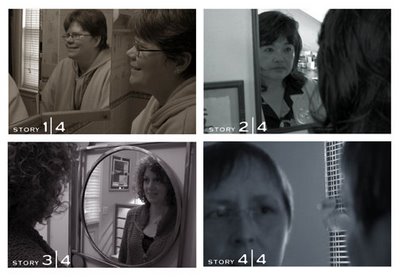
One of the pieces in my thesis exhibition will be my Survival Stories books. They have not been exhibited as books to be handled before, so I thought I would take that step since books are meant to be touched and handled. The books will each be situated on separate wall-hung lectern/shelves, and above each will be a large photo (see above) of each book subject. The stories are introspective narratives of four women cancer survivors, including myself. The photos that I chose for above the books are meant to portray looking into ourselves and examining our experiences- basically to map our journeys through cancer and survival. The use of a mirror helped us "reflect" on the stories that we were about to tell. The photos are duotones that reflect the tone of each book- we have our own personalities that come through in our narratives and use of color and image.

Thursday, November 09, 2006

Class class and more class

I'm working on class work this semester and am in Senior Studio and Adv Type. So far, I worked on a project with Angel creating the identitiy of an organic design firm. Now, I'm creating the identity of a small scale underwear company and am incorporating fibers through fabric and embroidery. I'm printing on fabric (such as the cover of my annual report and hang tags for the underwear) . I am using this project to find out where fiber arts and graphic design meet.

Friday, November 03, 2006

Sustainability Design

Lately I have been working on 2 books dealing with overpopulation/population control. One is a desk calendar book and a condom book. The calendar book deals with the transition of time and how population has increased over the years and how it has impacted all of us in some kind of way. I decided to make it into a calendar because it deals with time. As the time progresses the population increases as well as problems, I plan to show those problems through the images and text.

The condom book deals with all the methods that we can use to control overpopulation. It will be package in a condom box. I plan to have 20 different methods of birth control and each of them will look like little posters on the back of a condom wrapper. This condom book will be text dominated while the calendar book will be image dominated.

I’m having a good time with these books, specially the condom book uhaaaaa!!

Friday, October 27, 2006

Quo vadis?

Where are you going?
I've been getting this question a lot since I started on my MFA. Everyone thinks I am moving on, when in fact I am rooted here. Where I am going with this MFA journey is on a design investigation. I've always liked to plan and map out a place before I visit, and this journey is no different. My thesis will reflect on ways in which I have investigated process and design issues, and cultivated my role as a designer/educator. It will also discuss the conceptual use of mapping as a metaphor and delve into imagery and design that visually interprets experience- of a place or a life event. I have been exploring the concept of topophilia- establishing a conceptual and emotional bond with a place- and what a visitor viewpoint can bring to a "place."

I will be writing about some of the solutions I have created, specifically my Survival Stories books, the Vision Chicago project, Prairie Mosaic poster, and most recently the Fabulous Desert Ecotone project with deck of cards.

Tim and Eric and I are collaborating on a "Conversation Map" of i-chats we are having relating to thinking about our thesis and exhibition. This will be an intertwining piece for our exhibition- showing our thought processes along the journey. More on this later as it develops!

Wednesday, October 11, 2006

Who is Designing for the Poor?

In the book/magazine "Plugzine", there is a Chinese article that discusses designing for the poor. I thought it would talk about designers doing things for poor people, kinda like donation our skills or something of that nature. But it didn't.

There were various points, but 2 that struck me. One were designers that were designing pieces (like furniture) out of reused materials. So, a chair designer made a "Rag Chair" our of old pieces of cloth. Another used bottles. etc. The basic idea was in a world were resources are becoming more and more limited (aha! "Sustainability"), to find ways were you can express design while reusing materials.

The other was not about designing for the poor, but rather poor designers designing. And it doesn't mean poor college students. It means real poor people who have a need for advertising, but don't have the modern tools we do (like computers, copy machines, etc.). Their concern isn't about what the next cool program is or how to do this and that on a layout. Their concern is how to promote something with just a handful of drawing supplies.

Where this is really predominant in China (again, this is a Chinese article), is in the band scene. Bands need ways to promote themselves. But without money to make copies or color flyers, their designers end up using markers to individually draw up each flyer! These were not scribbles of notes that are quickly drawn; each has a unique labor of love! The end result is something edgy with hand-drwan types and human in each flyer and more direct to the audience. Painted posters and handbills (like San Francisco in the 60's). An expanding visual style that led to a handpainted magazine (it didn't last, but what an intriguing idea).

Now with China's modernization and push forward, this design art is slowly being pushed aside for more modern and fancy stuff. It was an intriguing idea. I can only imagine the reaction of students if we said you had to to do a full-on promotion using no computers or copy machines! Labor intensive, but probably a lot of fun once you get into it?